Working on your Salesforce Experience Cloud portfolio? Here's a list of ten pieces of feedback I received, and I am currently working on incorporating into my next version:
1. Think about the consumer. As much as you might like your portfolio, you are not likely the consumer. You likely built your portfolio for a recruiter or hiring manager. Try to look at it from their lens. What kind of experience do you want them to have there?
2. Get rid of the Login button in the top right corner. If you're not expecting others to log in to your portfolio site, it shouldn't be there.
3. Get rid of the search bar. Are you confident about what results could be turned up? Is it necessary? Is it useful? No on all three counts for me.
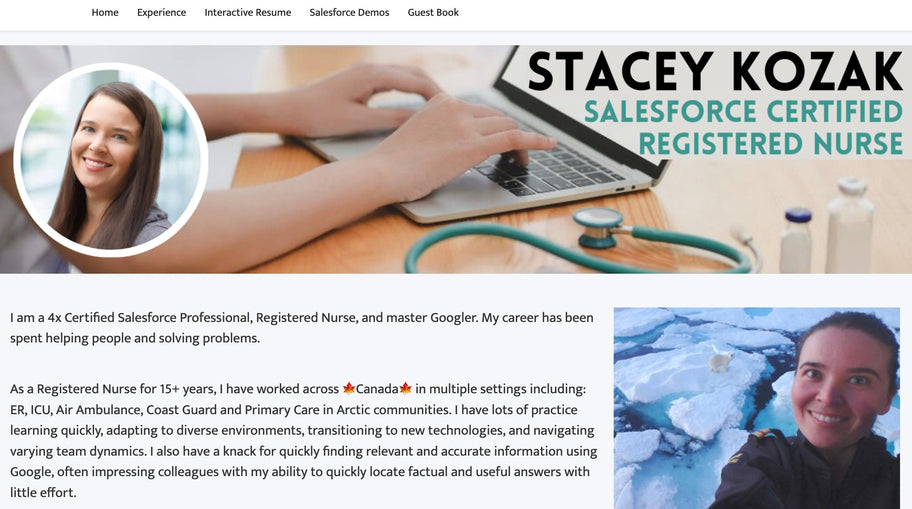
4. My first iteration used a my LinkedIn banner for simplicity and consistency. It took up too much space on the desktop when it was loaded. Banner shouldn't be big.
5. Get rid of the buttons on the home screen. If the first page I want someone to navigate to is the About Me page, then make that the home page. There is a menu already at the top of the screen, so people can navigate elsewhere if desired.
6. Use leading sentences with clickable links at the bottom of each page. If your goal is to lead people on a journey through your portfolio, then lead them where you want them to go. Don't let them click aimlessly through your menu bar.
7. Don't repeat things too many times. I had an interactive Salesforce resume on one page, and on another page I had a JPG resume that showed automatically, and icon links to a WORD version, PDF version, and Salesforce contact record screenshot. It was too much. "If you were to build this for a customer, would you build it with 27 links everywhere?" Now, I have my interactive resume and PDF resume icon in the footer.
8. Keep the pictures in. They humanize you. They share a bit of who you are, and what you are about. You're not just another LinkedIn headshot.
9. Web to Lead form - Add a picklist for a general visitor and one for a recruiter/hiring manager. Send them different email response, as likely the message you have for each one would be different. (Still on my to-do list)
10. Is it scalable? Brought up as a likely interview question about the portfolio. In my first version, if I got another cert I would need to update my banner, About Me page, Experience & Certs page, my PDF resume, and my Salesforce interactive resume. That's too much. If I was to build something for a customer they wouldn't want to have to do 20 updates every time they wanted to incorporate something new.
Written by Stacey Kosak


